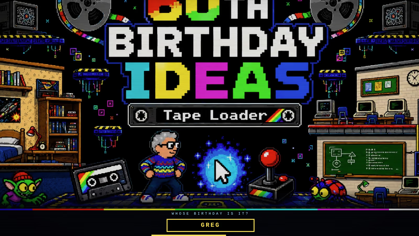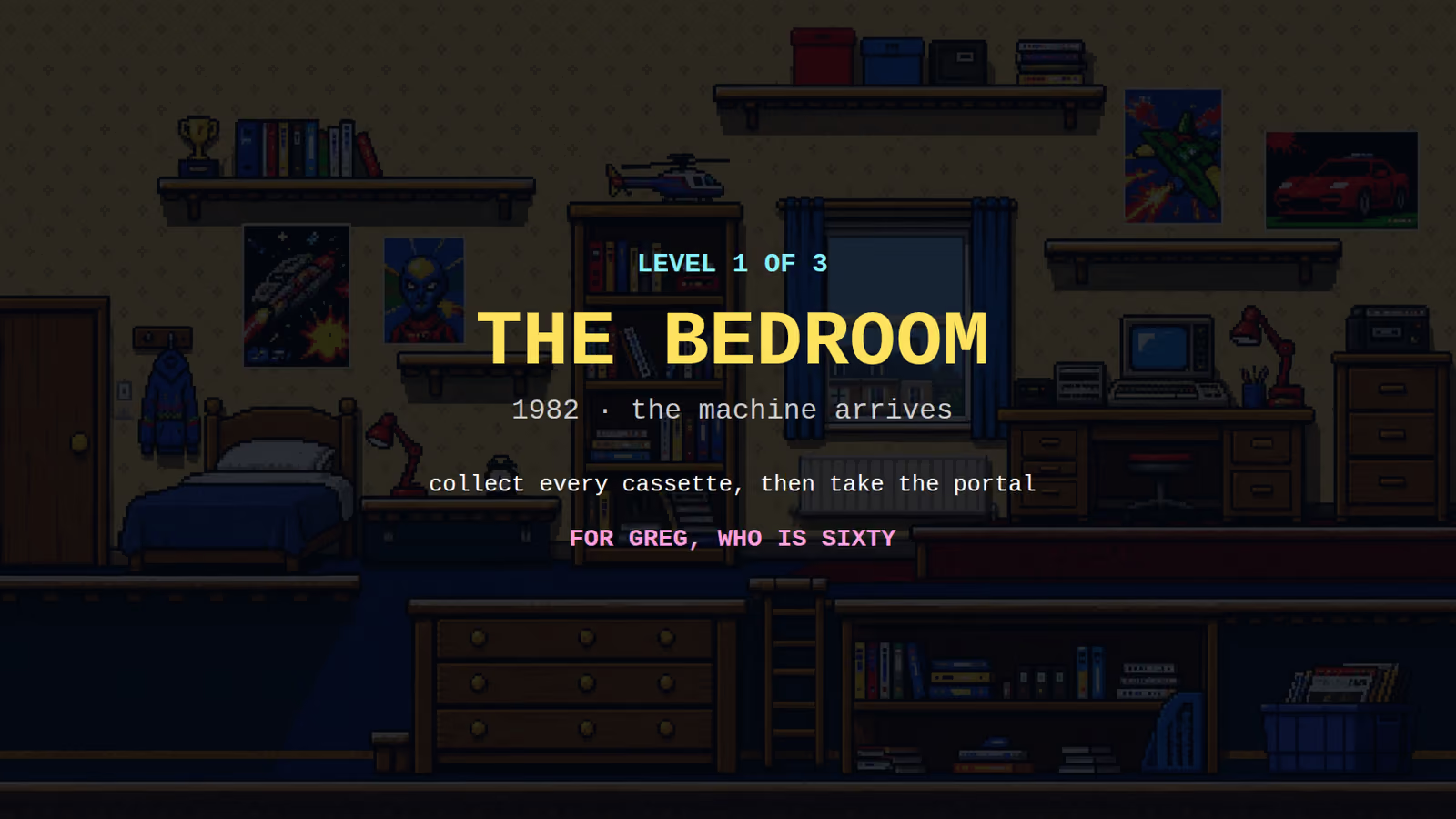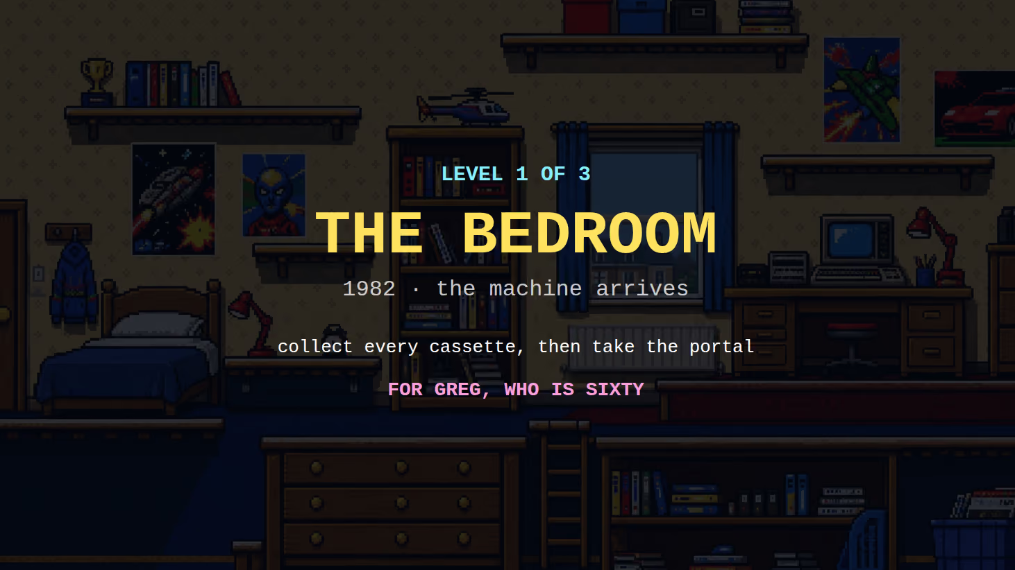
A game with a small palette looks deliberate. A game with an unrestricted one looks like a photograph of a jumble sale, and the player cannot find anything in it.
That is the whole argument, and it has almost nothing to do with the hardware limitations the technique came from.
The historical reason, and why it is no longer the reason
Early machines could display a fixed and very small number of colours, sometimes with rules about how many could appear in a given area of the screen. Artists worked within that because there was no alternative, and the visual language of that era, which is what our Tape Loader build is quoting, comes directly from those constraints.
None of those constraints exist now. A browser will happily draw sixteen million colours and never complain.
The technique survived anyway, because it turned out the constraint had been doing a second job nobody had separated out: it was making games legible.
Reserving colours is the real technique
Here is the useful way to think about a palette. It is not a list of colours you are allowed. It is a set of reservations.
Pick a large family of related, slightly muted colours and build the entire world out of it: backgrounds, walls, floors, furniture, scenery. Then take two or three colours that are noticeably brighter or more saturated than anything in that family, and use them nowhere except on things the player must notice. Collectibles. The exit. The character.
Now the player does not have to search. Anything wearing a reserved colour is either you or something you want, and the eye finds it before the brain has read the scene. Nobody notices this happening, which is exactly the sign that it is working.
Break the reservation once, by putting the collectible colour on a decorative lamp in the background, and players will walk into that lamp. Repeatedly. And they will not be able to tell you why the level felt confusing.
Value beats hue
The mistake people make is thinking in colours when they should be thinking in lightness.
A blue character in front of a brown wall sounds well separated. If the blue and the brown are the same lightness, the character vanishes into the wall, especially in peripheral vision and especially while moving. Hue is a much weaker signal than value, and it collapses entirely for the substantial number of players with a colour vision deficiency.
The test is to take the screen, remove all colour, and look at it in greyscale. If the character does not immediately stand out as lighter or darker than what is behind it, the separation is not real and the colour was carrying it.
This is also why so many games put a subtle dark shadow under the character, and why ours draws a soft ellipse under the player before drawing the player. It is not there for realism. It is a guaranteed patch of contrast that travels with the character across whatever it happens to be standing on.

The palette is a deadline, not a preference
The practical thing to understand about a palette in a commission is when it gets decided, which is early, and why it cannot move, which is that everything after it is made against it.
Once the world's colour family is set, every background is painted in it. Every character is painted to sit against it. Every interface element is chosen to be legible over it. Change the family at the end and all of that stops being true at once.
This is not a matter of taste being locked in. Taste is discussed at the start, sketches are produced, and the direction is agreed. What is locked is the palette as an engineering constraint, in the same way and for the same reason that a jump arc is locked before a level is laid out. That ordering argument is set out in why game artwork gets drawn twice.
Interface colour is a separate reservation
One more layer, easy to forget until it goes wrong.
Score, lives, timers and any text laid over the game need their own reserved treatment, because they must be readable over every scene the game contains, including the bright ones and the dark ones. A palette that works beautifully for the world can leave a score counter invisible over one particular background.
The usual answers are a reserved accent used only for interface, a drop shadow or outline so the text carries its own contrast, or a semi-transparent band behind it. Our platformer template uses a text shadow on the heads-up display for exactly this reason: it costs nothing and it guarantees the numbers are readable over a background nobody has seen yet.
What this means for a commission
A restricted palette is a legibility decision, not a retro one. It applies just as much to a hand-painted adventure as to a pixel-art platformer.
Say early if there are colours that matter. A team's colours, a wedding's palette, the shade of somebody's favourite jumper. These are easy to build around and expensive to introduce later.
And check it in greyscale. If you ever want to know whether a game's art is going to work, that is the ten-second test, and it is the one that catches the problem people describe as "I keep losing my character".
The palettes in both builds in the arcade are doing this. Try to find the collectibles without looking for them; you will not be able to avoid it.