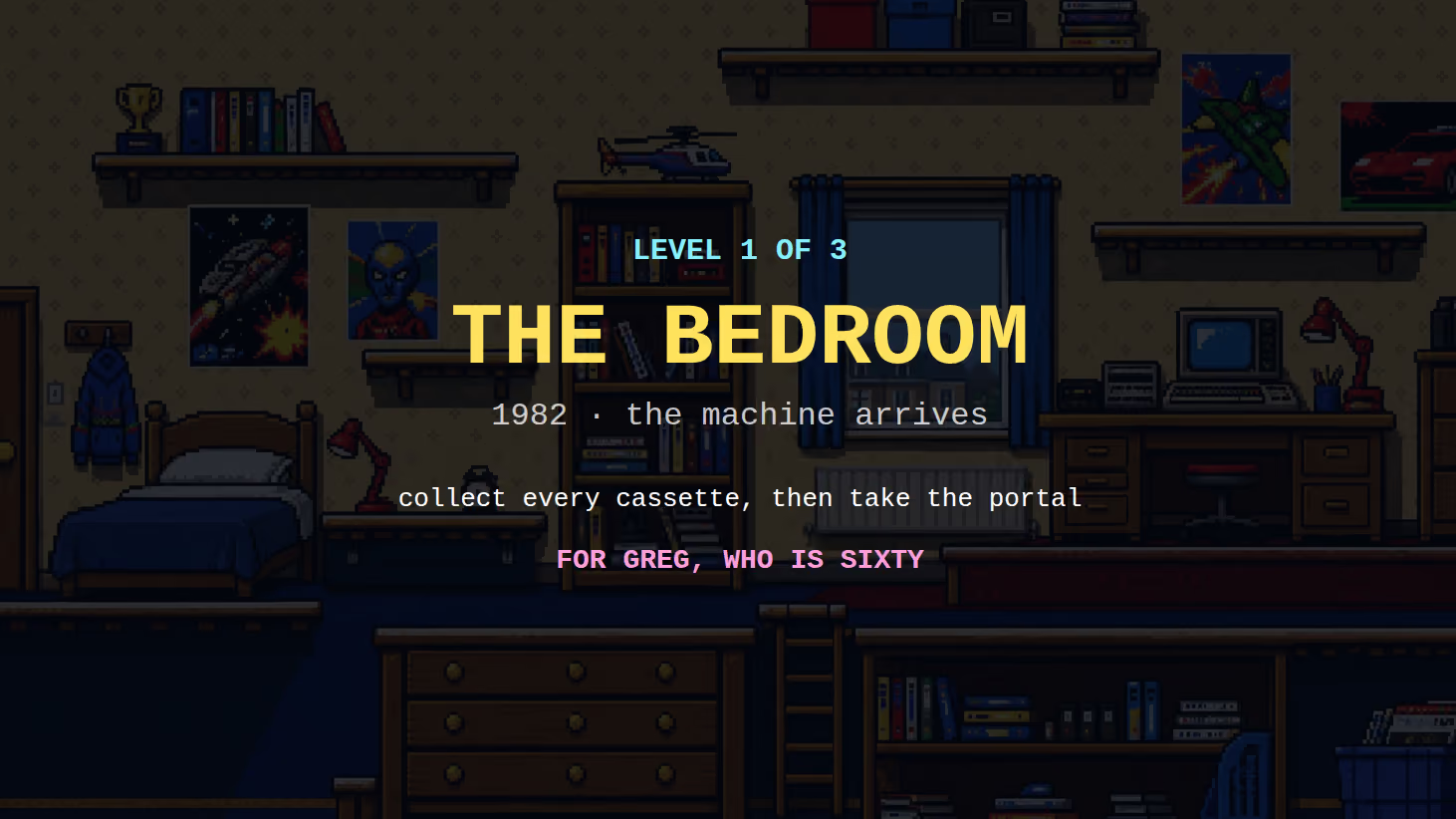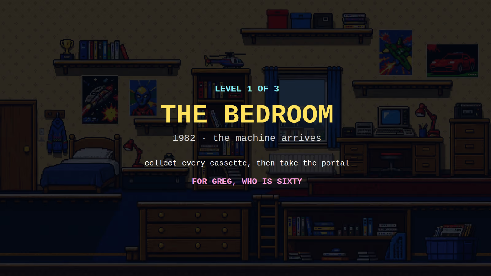
The first level of a game is not a level. It is a lesson disguised as one, and the measure of whether it worked is that nobody realised they were being taught.
This matters more for a commissioned game than for anything else we could build, because the person receiving it did not choose to learn a video game. They were given one, by somebody who loves them, and if it takes ten minutes to work out how to move then the gift has failed regardless of how good the artwork is.
Nobody reads the instructions
Start from this, because everything else follows from it.
A screen of text before the game is a screen people skip. Not some people. Almost everyone, including the people who will later say they did not know how to do something. It is not impatience, it is that reading is not playing and they came to play.
So instructions can exist, and should, as something a player can choose to open. Ours sit behind a button on the title screen. What they cannot be is the mechanism by which anybody actually learns the game.
The game itself has to do the teaching, and the tool it has is the shape of the first room.
Make the only thing possible the thing to learn
The classic method, and it is classic because it works.
Put the player somewhere with one obvious direction and one obstacle. The obstacle should require exactly one action. There should be nothing else to do, nothing to collect, no second route, and no way to lose.
A player walks right because right is where the room goes. They meet a gap. They try things. They jump. They cross. They have now learned to jump, permanently, in a way no caption achieves, because they did it themselves and it worked.
Then the game can build: a gap that needs a running start, a platform above them, something to collect that is slightly out of reach. Each one adds a single idea to something already understood.
What breaks this is a first room with three things happening in it. The player learns none of them properly and arrives at the second room without foundations.
Consequences small enough to learn from
A player learns by getting it wrong, so getting it wrong has to be survivable.
In our platformer engine, falling off the bottom of the level does not kill you. It puts you back at the start of the level with nothing lost. At the gentlest difficulty setting there is deliberately no way to lose at all: an infinite number of attempts, no lives, no failure state.
That is a real design position rather than a softness. A four-year-old who loses a life learns that the game is against them. A four-year-old who falls and reappears learns that falling is fine and tries the jump again, which is the actual goal.
For an adult the tolerance shortens, and the spiciest setting introduces a limited number of lives, because a game with no possibility of failure is not tense and an adult wants some tension. Same level, same layout, three tunings. That range is the subject of designing one game for a four year old and an adult.

Teach by placement, not by text
A few concrete techniques that cost nothing.
Put the first collectible where they will walk into it. Not somewhere clever. Directly in the path. The player collects it by accident, hears the sound, sees the counter change, and now understands the entire collecting system without a word being written.
Put the second one slightly out of reach, upward. They will jump for it. Now they have connected jumping to collecting.
Show the danger before it can hurt. An enemy visible across a gap, patrolling, before there is any way to touch it. By the time contact is possible, the player already knows what it does.
Let the layout point. A path that narrows leads. A platform placed slightly above and to the right suggests going up and right. Players follow shape without noticing they are doing it.
The controls that need no teaching
The best tutorial is the one that is not needed because the controls are already known.
Arrow keys move. Space jumps. Clicking a piece selects it and clicking a square moves it there. These are conventions, and a game gains nothing by being original about them. Originality in controls is a cost paid by every single player for the benefit of nobody.
Our chess build is the clearest case: click a piece, click a highlighted square. There is nothing to learn, because anybody who has used a computer already knows it, and the game spends none of its first minute explaining.
On a phone the equivalent is showing touch controls only while they are usable. Our platformer had a real defect here that only appeared on a real device: touch pads were visible over the title screen, sitting on top of the buttons the player actually needed. Fixed by only showing them during play. Found by testing on a phone, which is where interface bugs live and where they do not show up on a laptop.
Knowing whether it worked
There is exactly one reliable test and it is not an opinion.
Give it to somebody who has not seen it, say nothing at all, and watch. Do not explain. Do not answer questions. Write down every moment they hesitate.
Every hesitation is a place the game failed to teach something. It does not matter whether the design was reasonable; the player was confused, and the player is the evidence. That method is worth its own discussion, in what one person watching can tell you.
What this means for a commission
The first thirty seconds is the whole gift. If somebody cannot get moving, nothing after it exists for them.
Tell us who is playing and how old they are. It changes the first level more than it changes anything else.
And ask for the game before the party, not at it. The one thing that cannot be fixed on the night is a first level nobody has watched a stranger play.